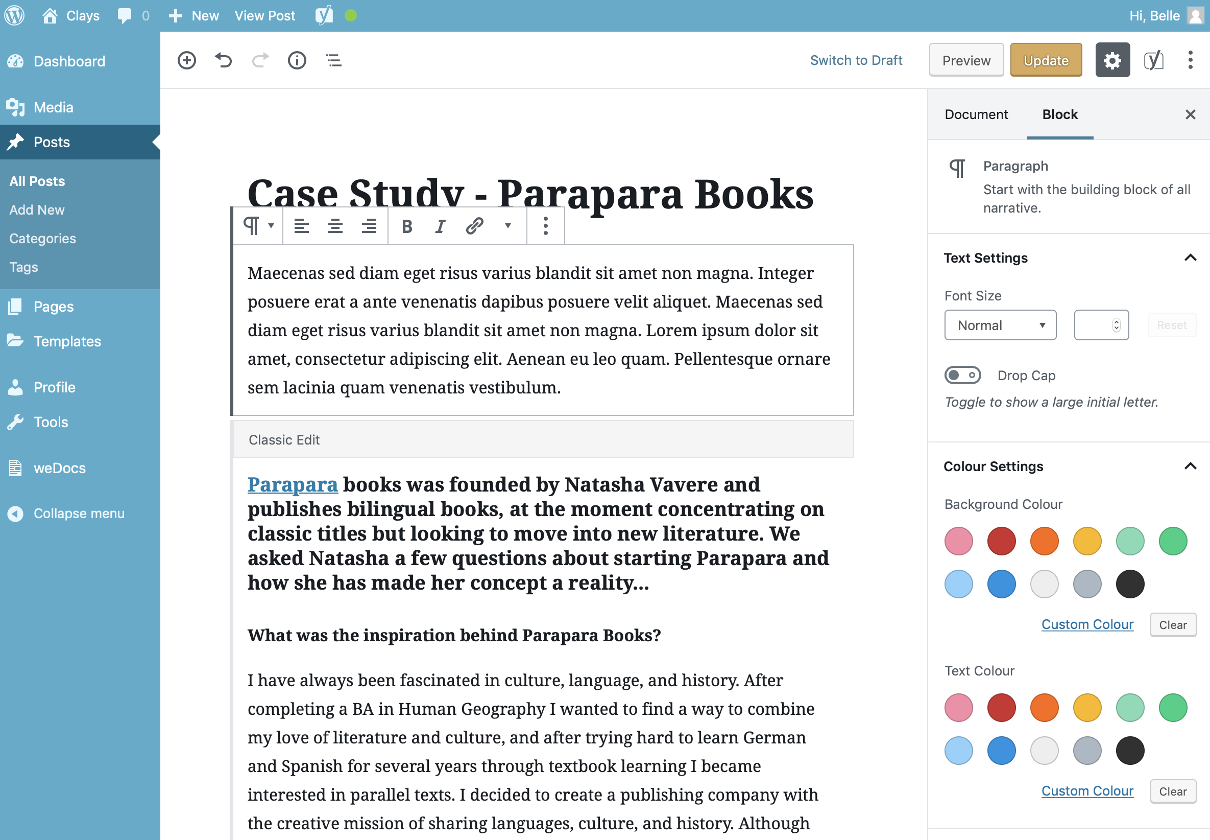
The Paragraph Block allows you to enter a paragraph of text. Each paragraph is a new block so when you hit the Enter key to start a new paragraph, a new Paragraph Block will be automatically inserted as you continue to type.
Once you’ve added your content to your Paragraph Block, there are further options available in the Settings Sidebar.
Since all posts on this website are formatted automatically using custom page templates, it is advisable not to edit the base font or colour in order to maintain the designed look and feel. However the below options are available should you wish to use them.
You can change the size of the text using the Font Size dropdown or the number field next to it. The Dropdown field has some preselected sizes such as Small, Normal, Medium, Large and Huge. The exact size of these, and the names, will be dependent on the theme that you’re currently using. If you want to select an exact pixel size, you can use the number field next to the dropdown to enter an exact number. Click the Reset button to reset the Font Size back to its default size.
The Drop Cap switch allows you to turn the first character in the paragraph to a Drop Cap. A Drop Cap is where the first letter of a paragraph is enlarged to “drop” down two or more lines. Drop Caps are typically used to grab a readers attention. The Drop Cap will only display when the block is selected. When you’re adding content to your paragraph block, or editing existing content, the first character will display the same size as the rest of the paragraph text.
The background and text colour can also be selected using the Colour Settings in the Settings Sidebar. By default, there are a number of pre-selected colours to choose from as well as a custom colour picker, for selecting any colour.
The colour picker allows you to enter a custom colour value in hexadecimal. The colour palette used within the website is as follows:
- Primary Blue: #0e6ba8
- Clays Blue: #003057
- Mid Blue: #004e8e
- Highlight Blue: #06bee1
- Accent Blue: #a6e1fa
- Pure White: #fff
- Text Grey: #4c525a
- Drop shadow Light Grey: #f4f4f4
If the colour combination that you select for the background and text are hard to read, you’ll be prompted with a warning advising you that “This colour combination may be hard for people to read. Try using a brighter background colour and/or a darker text colour“. In this instance, it’s advisable to use either a brighter background and darker text colour, or a darker background and a brighter text colour.
